ZOUBISOUBISOU
Chocolatier & Coffee:
Bitter, Sweet, Alive
Bitter, Sweet, Alive
Strategy & Creative Direction
Miranty Annisareta
Project type: Concept study
Strategy, Branding Identity, Collaterals
2024
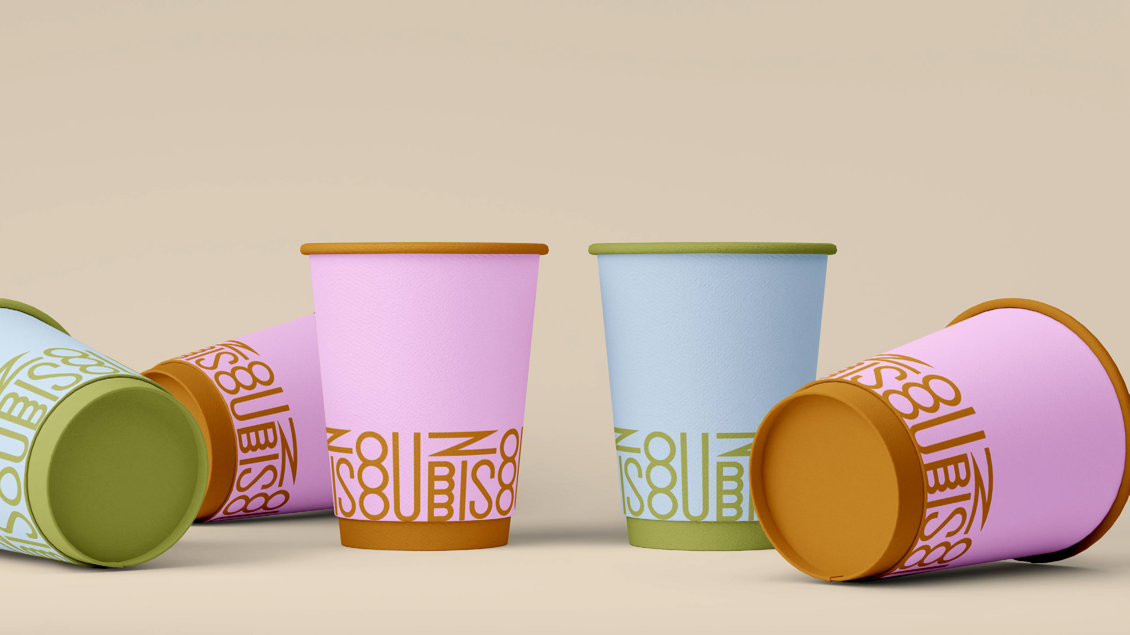
ZOUBISOUBISOU is a story about fun, flirtatious, and light-hearted self-love. The brand's visual identity incorporates a colour scheme combining blush pink and fiery red with powder blue and matcha green accents, luring customers into a world of vibrant luxury and irresistible secrets.
The tagline, "Bitter, sweet, alive," captures the product's whole sensory experience. The Bitter is the rich, complex basis of organic cacao, while the Sweet is the smooth, milky finish that results from careful craftsmanship. Finally, Alive conveys the sense of vibrant energy and guilt-free presence that comes with every bite.
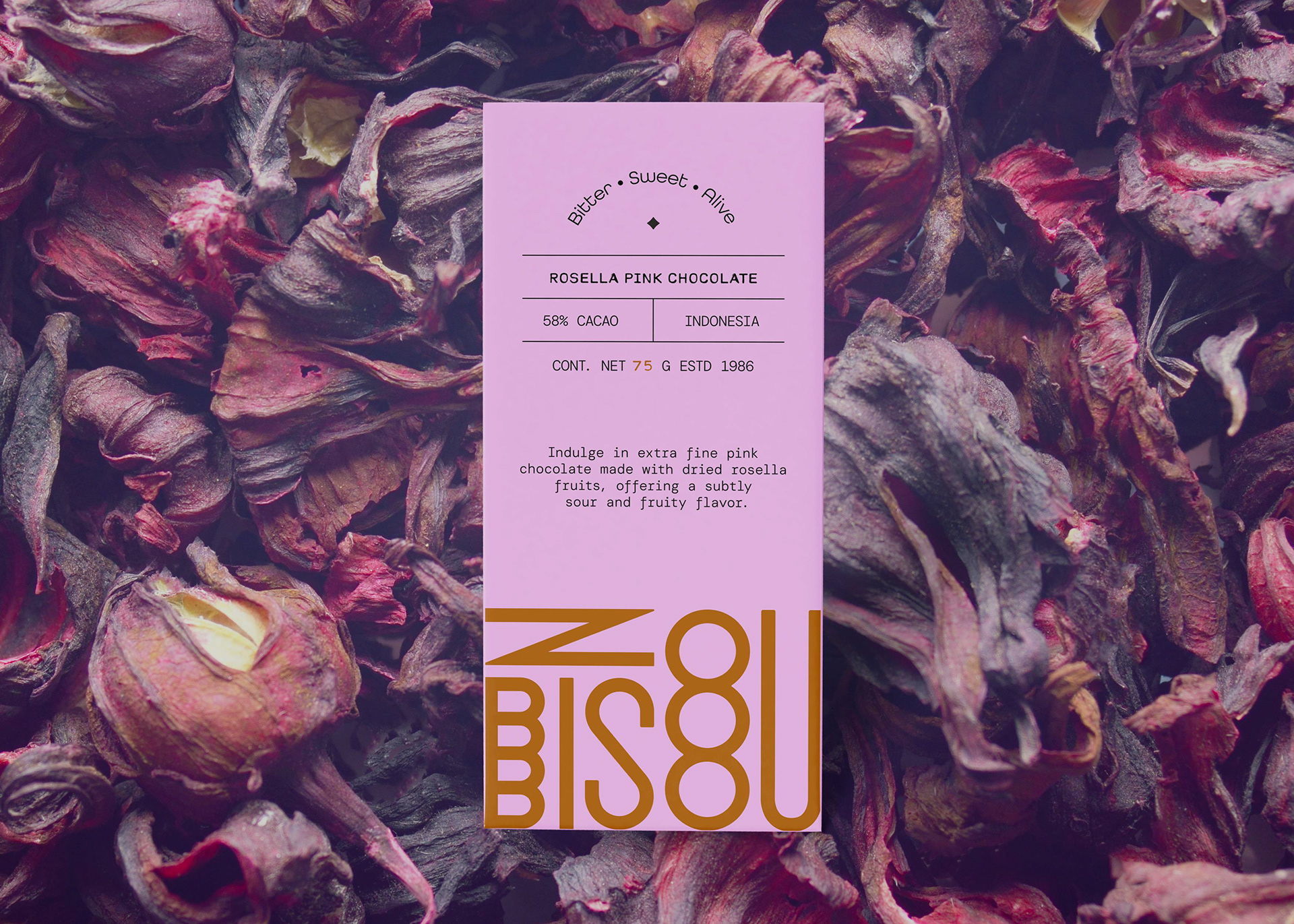


The chocolate is positioned as a sweetly scandalous way to indulge yourself, with a high-drama flavour and a low-maintenance count. The only number that matters is the craving. ZOUBISOUBISOU is the irresistible sweet spot where artisanal quality meets a truly exciting emotional connection.


